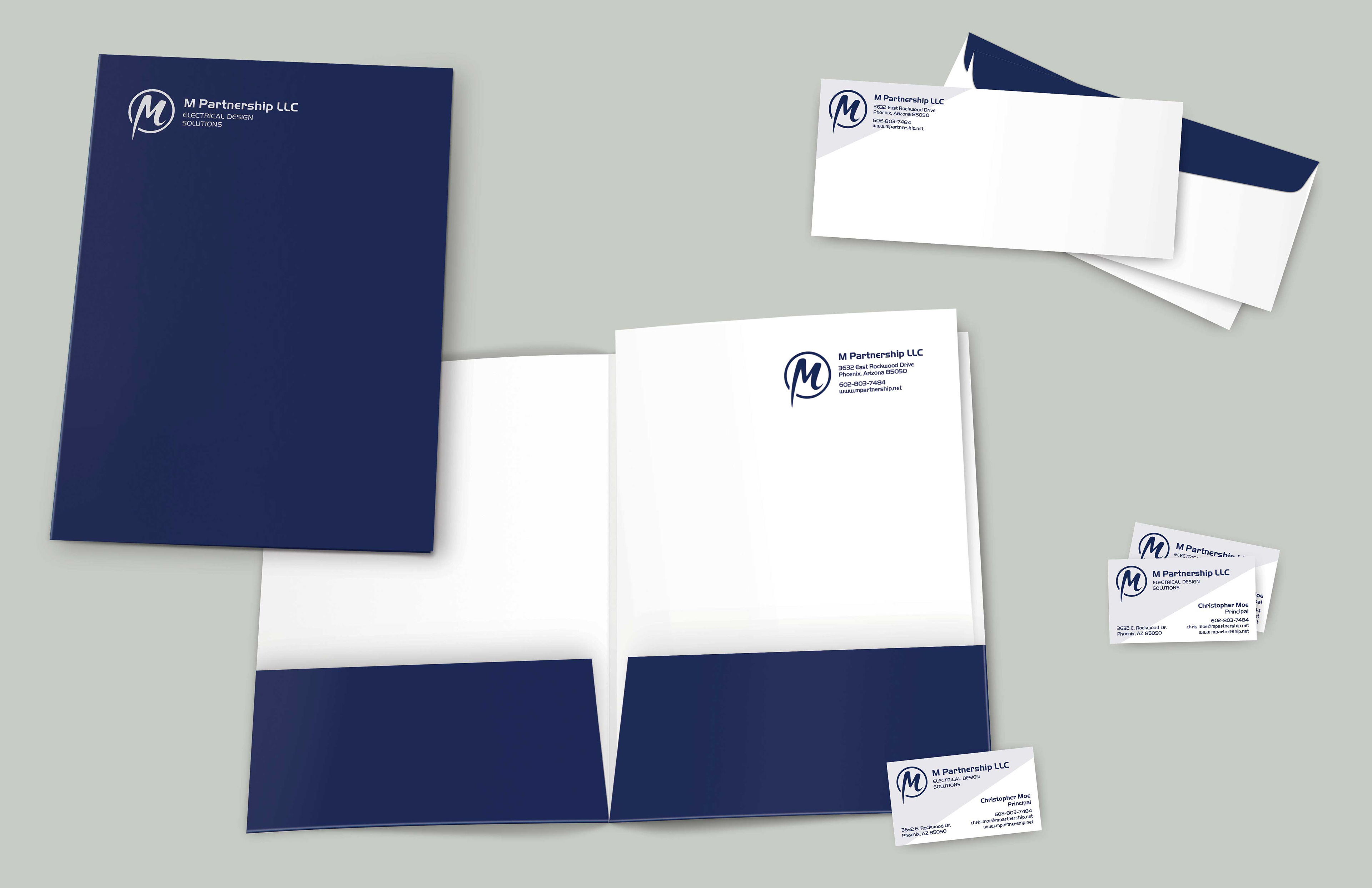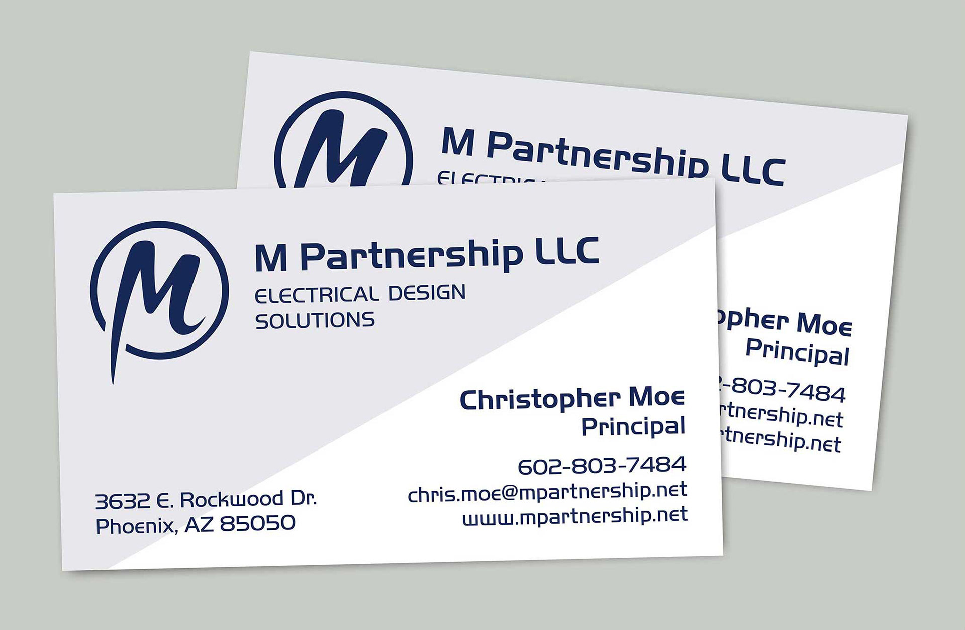
M Partnership LLC is an independent electrical engineering company in Phoenix, AZ. The client wanted a system that was simple and professional. Though the client did not have an existing brand, they used an existing font family across materials and wanted to incorporate this into the new brand. The solution includes an energetic logo design: The logo is enclosed in a circle, indicating that M Partnership is the complete package for a valuable clientele experience. The M letterform then emerges from the circle, representing how the company breaks the mold in their industry. The blue brand color represents sincerity, wisdom, and loyalty. Blue is dominant throughout the materials, with diagonals that represent the positive, upward momentum of the company.